Blog categories
Blog archive
RSS Blog posts of '2020' 'November'
Blog Filters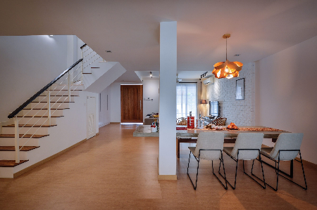
4 Ways to Use a Bench in the Dining Room
Friday, November 20, 2020
Create more space with a bench at the dining table and camouflage the arrangement with these tips.
You may have deliberately sought out a bench as a novel form of seating, or you might already possess a bench needing new purpose—either way, incorporating a bench into your dining arrangement could do more than free up some space. A bench helps to create a casual and intimate atmosphere for meals, and in place of two side chairs, takes up significantly less space. The extra floor space can then go towards greater clearance around the dining table, providing generous elbow room for diners, or even cabinets for additional storage options. If you are faced with an especially compact dining space, read on, as you may find one or two practical ideas for slipping a bench into your dining arrangement.
Island Ally
 Interior design by: Yong Studio
Having found an available wall against which to set your dining arrangement, your next concern would be to ensure the furnishings complement the surroundings. In the pictured home decorated by Yong Studio, the bench is composed from wood that is similar in shade and grain to the floor of the kitchen. This exercise in unification is applied to the other components of the dining arrangement: the table features unobtrusive legs of minimalist design, while the material of its surface is echoed on the other side of the wall in a diminutive shelf, and in the background, with the kitchen island.
 Interior design by: Yong Studio
Luxury Lines
As benches typically entail the absence of a back, the natural impulse in dealing with a bench would be to place it alongside a wall for back support. The wall-hugging arrangement, however, does more than free up space: beyond the practical consideration of ergonomics, the linear arrangement demonstrated by Surface R takes advantage of the Helmholtz illusion—a concept popularly applied in fashion to skew the perception of body contours. Just as with waistlines, the array of straight lines makes the pictured dining space seem wider and brings the furniture arrangement into golden proportions with the long and narrow space.
 Interior design by: Surface R
Tip: The Golden Ratio is one of the few aesthetic rules, if not the only one, that governs everything from the composition of art to the distribution of leaves along a branch. To form the most visually appealing composition possible, divide the length of a rectangle by the width and you should arrive at a figure approaching the Golden Ratio (φ = 1.618).
 Interior design by: Surface R
Divide & Conquer
 Interior design by: Jashen Interior Design
In tighter quarters, the placement of a dining surface against the wall is often necessary to preserve enough space for comfortably manoeuvring around the arrangement. In such a configuration, the substitution of two side chairs for a single bench frees up even more space, but requires that the bench be pulled out when needed and stowed when not in use. As Jashen Interior Design demonstrates with the pictured home, a wall bisecting the open layout is utilised as a background for the dining arrangement, with the bench tucked between the table legs to leave enough width for a walkway.
 Interior design by: Jashen Interior Design
 Interior design by: Jashen Interior Design
Focal Feature
 Interior design by: Jashen Interior Design
The open layout entailing fewer bisecting walls by definition, you may be hard-pressed to find a wall-hugging spot for your bench-augmented dining arrangement. If you find no free walls available, there exists the possibility for creative expression with a built-up partition. Without a readily available wall in the pictured open layout, Jashen Interior Design incorporates the bench side of this dining arrangement into a false wall built largely to serve as a decorative feature and primary focal point for the space. To keep the divider from overwhelming the open layout, a sizable portion of the wall is rendered reflective.
 Interior design by: Jashen Interior Design
Tip: While projecting walls may detract from the spaciousness of an open layout, the up-side is that any interruptions to the open layout you design will automatically become a point of focus in the scene and another available plane to embellish with messages or functional additions.
 Interior design by: Jashen Interior Design
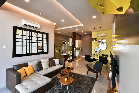
选择好沙发的5大关键
Friday, November 20, 2020
理想的沙发尺寸
客厅和餐厅的大小和扶手椅与沙发的尺寸一样有很多选择。在购买前,很重要的一点是确保我们所买的不仅要适合装饰的空间,还要确认是否尺寸刚刚好,不会太拥挤或留有很多空白。因此,请首先测量好空间的大小再去购买沙发,因为曾发生过购买的沙发放不进家里的情况。 首先要确定购买的沙发摆放的位置,是紧贴墙壁或放在客厅中间起到分隔的作用。确定好这一点后,请准确测量空间的大小并确保在前部和两边留出一定的空间。这听上去可能很多余,但事实上,当你到商店挑选时,看到的展示沙发通常都放置在比较宽敞的区域,因此会给人比实际尺寸要小的错觉。如果没有经过精确测量,之后就可能发生尺寸上的问题。 如果你对所有这些还不放心,也可以测量客厅的尺寸大小,以便店内的专业人士为你提供更好的建议。家人的生活习惯
如果说测量是重要的,那么沙发的使用以及使用者的习惯就更为重要。在这里孩子们会玩耍、还有宠物、用餐、午睡和各种各样的活动,因此在去商店里挑选前都要考虑这些因素。 多年来,随着纺织技术的进步,目前市面上为我们提供了非常多的选择。你可以找到具有不同特殊功能的数千种沙发饰面,比如防尘面料、防动物毛发面料、仅用水即可清洁的面料或者防宠物抓痕的面料。建议你在去店里挑选前,将所有这些因素都考虑在内,因为有儿童和宠物的家庭在清洗沙发方面又会不一样。从食物到记号笔,再到毛发、灰尘和碎片,甚至最糟糕的还有宠物的粪便。如果选错了沙发饰面,可能会让沙发变成你的敌人。舒适最重要
明确了以上两点,我们就可以去挑选沙发了。不要只考虑接触沙发的最初舒适度,还要考虑沙发的高度问题,这样之后才不会造成腰部不适的问题。建议高度是坐在沙发上腿可以和地面保持90º。扶手的高度和舒适度同样重要,应该在12到20厘米左右,确保无论是把手搭在扶手上还是头枕着扶手(特别在夏天尤为重要)都很舒适。最适合我的风格
现在就到了最有趣、最具创意的时候了,我们可以尽情发挥想象力,思考选择怎样风格的沙发才能将客厅打造成众人皆爱的空间。 首先是分析空间其他部分的装饰风格,这会帮助我们进行筛选,锁定寻找的装饰风格。如果我们考虑了之前提到的诸多因素,那么选择范围就会变小,我们也更容易根据空间尺寸大小、用途和舒适度挑选出合适的沙发。最后的细节
最后,我们会提供一些一般性的建议,让你能够挑选出好的扶手椅。 当我们在购买新东西时都希望可以尽快拥有,特别是像沙发这样特殊的物品。因此你肯定不希望选择不合适的沙发,然后受其困扰多年。不要只考虑是否能够马上拥有沙发,因为常常很多等待都是值得的。 有限的空间就必须选择大小适中的沙发,这会让视觉呈现充裕的空间规划,不会过于拥挤。—— casa indah
 沙发可以作为空间隔阂,尤其是对于开放式的空间规划。选择一幅足够大的沙发,作为客厅和其他空间的屏风,更有现代特色。——Jashen
 沙发的搭配上,不一定要单一元素,可以由布质沙发混搭其他木质沙发,让空间刚柔并济,增添另一番风味——Yong
 褐色的皮革沙发在客厅中独领风骚,2+2 的座位如果无法满足你的家庭成员需求的话, 建议你搭配藤制椅子/藤制单人圆座,来平衡空间中的单调。——nu i
 选择一个和客厅主题墙相等的沙发,也不外乎是一个好办法。这样的选择,有助于让格局更四方,寓意着好风水。——Zanotta
 一眼望去,大理石的 feature wall 和地板,让人感觉格外冷。因此,在这样的客厅里,布质沙发成了最好的选择,为了调和整个空间的温度。——Gesto
 另外,沙发的颜色选择则可以依据空间的主要色调来做调整。例如,空间中的主色调是浅色系的褐色,沙发的深褐就会为空间塑造出层次感。——PSQ
 客厅的沙发必须满足屋主和家人们的需求,因此原则必须依据各个家庭锁钉。因此,如图中的住户需要一个舒适的沙发让自己和孩子可以打成一片,故而选择倾向“床”设计的沙发。——Sky Creation
 你可从空间中的色调中明显感受出平和,这是因为空间中混用着不同层次的奶白色,由深至浅,由奶白至褐色。另外,皮革和布制沙发混搭,更显温馨。
 沙发除了可作为客厅的主角之外,它对于人流控制也起到很大的作用。例如,屋主不希望到访者经过电视前方,即可选择一个大幅的沙发,限制住空间,让客人无法经过。——id industries
 选择一幅和墙壁融为一体的沙发,是一个让有限空间看起来更大的小秘诀。如果你还在担心浅色沙发容易肮脏的,小编提醒你 Aqua clean 的沙发已经布满整个市场了!快去参考看看~——Nicestyle

 橘色的沙发,搭配上一张“百家被”概念的单人座位,让空间成为 fun color 的伸展台!——Q1
 白+灰+黄=让空间非常温柔且不失个人特色。在客厅的中央上选择一站特别设计的灯饰,让空间更增烟火气,更温馨的感觉。——TDI
 design integra
 开放式的空间规划,选择 L型沙发来作为空间中的主角。选择可以和任何颜色搭配的深灰色,让整个空间有大自然的感觉。——IDS
 ——Nu Infinity
 Surface R
 采光很好的客厅,长方形的格局搭配上简洁的双人沙发。皮革的材质让空间的格调提升不少。——Viinciology
 整个客厅的黄金闪闪,选择一幅白色的沙发来做调和。这样的搭配之下让人的眼花缭乱稍作调和外,还有一股低调奢华感。——Q1
 选择一幅和墙壁融为一体的沙发,是一个让有限空间看起来更大的小秘诀。如果你还在担心浅色沙发容易肮脏的,小编提醒你 Aqua clean 的沙发已经布满整个市场了!快去参考看看~——Alvin
 选择一个和客厅主题墙相等的沙发,也不外乎是一个好办法。这样的选择,有助于让格局更四方,寓意着好风水
 沙发除了可作为客厅的主角之外,它对于人流控制也起到很大的作用。例如,屋主不希望到访者经过电视前方,即可选择一个大幅的沙发,限制住空间,让客人无法经过——Gusto
 纯白色的空间,再配上米白的沙发,让人感觉有限的空间更宽大。但是,在左边,设计师还搭配上两张单人沙发,增添空间的实用性至于,还可调和空间中的纯白色。——Hoe and Yin
 全黑的沙发和厨柜紧紧相贴,这便轻易地成为空间中的隔阂。全黑的沙发让人感觉更神秘。Jashen
 典型的 L 型沙发,在左右两端?精心的头垫设计。放眼望去,空间是以白色和浅灰色为主要色调,因此一个特别花纹的地毯必定会让整个客厅多一个亮眼的“点”。——M innovation
 客厅中的主题墙,是以大理石为主,和地板的材质相似。因此,设计师在沙发的选择上,就大胆搭配深褐色的沙发,调和空间中的亮色调。——Mode interior
 途中的沙发特别大,不但结合 L型,而另一端还有圆弧形的设计。黑红色的绚丽搭配透露出设计师和屋主的大胆,让空间更有个人特色。——Mode interior
 纯白的 double volume 让整个空间变得更大,因此选择一个黑色的地毯和双人暗色沙发,让空间的大小更协调。至于浅色系的沙发上,设计师则选择亮黄色的抱枕,让人有眼前一亮的感觉。—— Nice style
 纯白色的客厅,用特别的沙发来带出其欧洲风。单人沙发的特别流线和小茶几的雕刻完美诠释风格。——Casa Indah
文章 by J
更多:如何挑选灯饰?
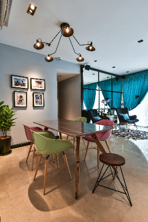
How to Select the Best Dining Table for Your Dining Room
Friday, November 20, 2020
The dining table is most often the central feature of dining spaces, contributing the most towards the décor by virtue of their size - which makes their selection all the more crucial.
The dining room is probably the one part of a home that sees the most people at any time - and whether people are just passing through or sitting down for meals, the table will have an impact on how diners perceive the space, the home, and the homeowner. As the selection of dining room furniture will likely be an event that does not occur very often, we wanted you to be as informed as possible before you set out on your journey towards your new dining table.
Material
 Interior design by: Viincology
The kind of material that your dining table is made out of will have an effect on its lifespan and its appearance. Long-lasting materials such as hardwoods, metals, tempered glass, stone, and even mould-injected plastics are preferred for dining tables that are expected to endure many years of heavy use. Conversely, lightweight or flat-pack furniture composed of veneered wood composites such as plywood or fibreboard are made with mobility and affordability in mind, these materials are preferred for short-term arrangements by virtue of their being easier to pack and transport by design.
 Interior design by: Viincology
Lightweight composite materials such as plywood or fibreboard are known to be significantly less durable, as they show a tendency to warp when subjected to excessive moisture or heat. Tougher natural materials such as hardwoods and stone tend to be porous, which entail regular maintenance with coats of varnish or sealer to prevent unintended staining from everyday use.
 Interior design by: SNG Conceptwerke
Due to their being porous and softer than metal, wooden surfaces entail a greater degree of care to ensure their longevity. Oil-based varnishes should be applied to wooden surfaces at the point of manufacture - and periodically afterwards to prevent unintentional staining. Despite the higher level of maintenance required, metal furnishings tend to rust - especially when used outdoors, while wooden furnishings take on a characteristic smoothness and polished sheen as they age.
Size
 Interior design by: Hoe & Yin Design Studio
Having too large a table surface will result in a cramped dining space, while restricting diners to a small surface leads to elbows bumping in uncomfortably close quarters. It is the recommendation of most decorators to provide each diner with around 60 to 70 centimetres (or 24 to 28 inches) of space for adequate elbow room, and around 90 centimetres to 1.3 meters (or 36 to 50 inches) between a dining table and the surrounding walls for diners to comfortably get in and out of their seats.
Shape
 Interior design by: IDS Interior Design
The shape of your dining table will determine the number of diners you can host and will affect the space it occupies. While round tables are capable of accommodating a greater number of diners, they tend to appear larger in small dining spaces - the conventional rectangular dining table takes up the most space, needing long and narrow spaces to avoid appearing overly large.
 Interior design by: IDS Interior Design
To calculate the number of diners appropriate for a round table: multiply the diameter of a table by the value of Pi (π: 3.14) and divide the result by the amount of space needed for each diner. Using the previously mentioned minimum of 60 centimetres (or 24 inches) of space needed per diner, a round table with a diameter of 1.5 meters can easily accommodate 7 diners, or up to 8 diners with a negligible reduction in elbow room - while a rectangular table of similar size (at 1.5 meters long) can only seat a total of 6 diners – one at each end and two along each length.
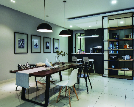
Creating a Well-Composed Dining Room
Friday, November 20, 2020
Whether you have a large formal dining hall or a small area for daily mealtimes next to the living room, here’s how to put together different interior features to ensure your dining room looks and feels good from every angle.
 Interior design by: The Roof Studio
Whether you’re hosting a family dinner or just getting together for a weeknight meal, the dining room is where people come together. From modern to classic, there are many ways to turn this room into a cosy space that is perfect for entertaining your guest in comfort and style. Gone are the days when you need to have matching tables and chairs at your dining table. The trend is to go for features that complement each other. If you are going for a modern look, aim for furniture that has clean lines and sturdy material. Also, make good use of tableware to pull it all together.
Palette Play
It's easier to create a well-designed dining room when you have a strong starting point to guide you - this is where having a colour palette in mind can really help you focus on the elements you can use. If you love a certain colour and have a particular hue in mind for your dining room, start with this colour.
 Interior design by: The Roof Studio
For example, yellows are a great way to create a bright and vibrant dining space. Start with light yellow for the walls, then add on bolder shades of complementary tones like blues. However if you are not confident about using bold colours, go for a neutral and monochrome palette, like the dining room pictured here.
Accent Pieces
Don't just stop at tables and chairs in the dining room. If you have space, accent furniture like a console or an armoire can work wonders to help create a focal point and enhance those blank walls that envelope your dining area. However, choose something that blends with your dining table.
 Interior design by: Chaplins Furniture
In this dining room, a bright blue console works beautifully to bring attention to the table. The decorative accessories and mirror above the console add a lively look to the atmosphere. The bold pendant lamps are also just the perfect features to balance off the the space.
Material Maneuver
 Interior design by: Mode Interior Style
Mixing and matching different materials in the dining room can offer a dramatic yet personalised effect to your space. Balance is key, as you don't want a single material to overwhelm the rest. Also offset hard and sturdy surfaces with soft furnishing to give your space a sense of cosy warmth.
 Interior design by: Mode Interior Style
In this dining room, there is a bold variety of materials ranging from solid wood and faux grass to brick-like finishes on the opposite wall. The addition of the marble-like feature wall balances off the dark-coloured surfaces. The use of wood flooring just around the dining space also helps to demarcate the space clearly.
Vibrant Variety
Another way to mix materials is through a variety of different seating and surfaces. Mix-and-match seating works well when each chair or bench is of a similar style and shape. Also think about what you use as centrepieces on your dining table.
 Wood and ratan are making a huge comeback in the dining room, but those from the lighter range are preferred. Go for a Zen effect but break from the monotony with stronger tones and textures. Interior design by: iDecorate
In this warm and neutral dining room, the woven rattan chairs bring a sense of similarity to the entire set, but if you look closely, every single piece is individual in style. To further enhance the room, a tableware set with a similar look and feel is used.
Trendy Tableware
 Interior design by: iDecorate
Finally, complete your dining room with beautiful tableware to bring everything together. When it comes to choosing a dinnerware set, the choice is usually a matter of personal taste. It’s a necessity for any table, but it also sets the mood for a meal. For example, formal china can make a momentous occasion feel even more special, while basic stoneware is a good match for a low-fuss weeknight dinner.
 Colour coordinate your tableware by having a neutral backdrop and then enhancing it with bolder tones through colourful plates, bowls, and mug. Interior design by: Dunelm
In the example here, a white dinner set complemented by green accents bring out a nature-inspired theme that enhances the wood dining table. To add texture, fabric placemats tone down the hard surfaces and introduce a lush quality to the space.
 Interior design by: Dunelm
Article by: Lily Wong
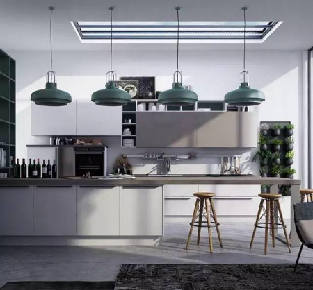
颜色配得好,空间自然高级!
Friday, November 20, 2020
在欧美国家,完备的设计团队里通常会有专门的色彩设计师,来替大家完成家居整体的风格定夺。
但是国内就很少有这样的设计师,那么不懂得色彩搭配的我们也想将自己的家打造成点赞超多的网红之家该怎么做呢?
首先你得掌握一些色彩方面的知识,多看一些配色的案例。
只要提高了自己的色彩知识和审美水平,就能完成空间变形的魔法哦(让你的家看上去大一倍)!
最关键还能省一大笔装修预算,颜色用的好,高级感自然而然就来了,根本不必靠钱去堆砌~
【家居色彩小入门】 01/ 法则 尽量整体多使用低纯度的色彩 纯度,是色彩的鲜艳程度。
孩子们一般喜欢的明黄、翠绿都属于高纯度。最近流行的黑白灰性冷淡风,则属于低纯度。
在家居中,高纯度的颜色最好不要大面积使用。
从健康上说,它们让眼睛负担过重,长时间盯着看容易引起头晕、烦躁、易怒等后果;
从品味上说,它们很难搭配,大面积的使用容易造成审美疲劳,也容易让家居风格变得土气。
02/ 法则
使用色彩来改变视觉空间
其实颜色也可以从视觉上改变空间大小,所以用对了配色,你的家可能能大20平方!
纯度低、明度高、冷色相的颜色,就能放大空间。
 ▲明显显得空间空旷了很多
而纯度高、明度高、暖色相的就是膨胀色,比如明黄色、橙红色,它们看上去像太阳一样发光发热,会让小空间显得更拥挤、燥热。
 ▲明显显得空间狭小了很多
浅色有上升感,深色有下坠感。所以层高低的房间,可以在顶面用浅色、地面和家具用深色,强行拉开顶、地的视觉距离。
 ▲天窗也是一样的道理
03/ 法则
控制空间色彩数量
 黑白灰之所以那么流行,就是大家渐渐知道,对于家居设计,简约就是美。可是,简约不代表就一定只能选择性冷淡的颜色哦。
有个流行说法:空间配色不得超过三种。(当然并不包括黑白灰这些无颜色系)
颜色少搭配起来相对容易,对于没有多少配色经验的人来说还是有意义的。不过,颜色少却能让空间看上去十分的立体丰富还是需要功力的,因为除颜色之外,还要考虑花纹图案、材质等因素。
下面小编就搜罗了几种配色方案,能让家居设计更加高级和有质感。
“莫兰迪”色系
家具配色的最高境界
 学过绘画的小伙伴一看也应该就懂了,所谓的“莫兰迪色”不就是高级灰嘛,画面平和自然,舒缓雅致,有一种静态的和谐美,其实也就是现在大家所说的“性冷淡”风格。
颜色简单却不单调,虽然失去了原本饱和度的强烈和浓重,反而显得更柔和优雅,在家装中运用得好会显得很有高级感和温柔感。
 ▲由于灰色的清冷气质难以驾驭,搭配不好就很容易营造出一种生硬冰冷的感觉,缺乏生活气息,容易产生距离感。所以可以结合各种类型的布艺家具来达到冷色系和暖色系之间的平衡。
 ▲如果你真的觉得灰色有点单调,那就用极具时尚腔调的灯光来渲染,以光泽感带来无与伦比的视觉效果,让喜怒无常的空间变得高级又有范儿。
 ▲有人说,品味极好的商务男士最爱这种配色的厨房,灰色与生俱来的低调与厚重,与男士身上彰显的绅士气度不谋而合。
 ▲纯净的灰色会营造出一种空间扩大感,水泥的质感也有那么一点复古的工业气息。
 ▲如果不知道要买什么色系的床品,灰色一定不会错,效果总好过那些卡通人物和民国大牡丹。
蓝色系
那一抹深邃优雅的风情

 绿色系
从时尚界到家居界的新宠儿


 更多文章:延禧攻略室内设计
Step Storage: 7 Creative Under-Stairs Storage
Friday, November 20, 2020
The empty space under the stairs sometimes gets a bad rap on account of the many stories depicted in film that paint this potential storage space as a nest of insidious horror - or at the very least, a place of relative obscurity where things go to be forgotten. But in this modern age of urban living - where gratuitous space typically comes at a premium, we felt it be prudent to look at these spaces under the stairs in a new light, in order to discover novel ways of incorporating storage options.
Climbing Cabinetry
 Image Credit: Buj+Colón Arquitectos
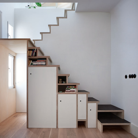
In a compact space where a full-fledged staircase would have been overwhelmingly large, a lightweight stairway is formed out of progressively taller cabinets and bookshelves, with an intermediate split-level landing simplistically projecting from the top of the cabinetry. The result is deliberately left without a railing to achieve an unobtrusive stairway that is ingeniously disguised as storage.
Footwear Hideaway
 Image Credit: Post Architecture
The act of removing one’s shoes when entering a home has transitioned from being a distinctly Asiatic custom of tradition to a practical measure in many urban homes around the world - which necessitates considerable storage fixtures to be incorporated at the entryway. The pictured shoe drawers, designed by Toronto-based Post Architecture, enable a sizable family’s worth of shoes to be neatly stowed away in the unassuming space beneath the stairs.
Stairway Stack
 Image Credit: Schemaa Architects
While a stairway with a steep incline may present a formidable barrier to the upper floors, the complete use of extra space for cabinetry helps to disguise the risers and treads of the pictured loft-style staircase. To soften the gradient of the stairway, Schemaa (a Parisian architecture firm) incorporates intermediate blocks of wood to break up the high risers of the steps - resulting in a more graceful incline.
Aperitif Alcove
 Image Credit: DIY Network
An alternative to wholly dedicating the space under the stairs to storage is put forward by the DIY Network’s Watson Hawkins. The idea entails moving beyond pure storage and adding a facet of functionality to the space. In the pictured example, nearby countertops are extended to the space beneath the stairs, with cabinetry truncated at an angle to match the slope of the stairway’s carriage.
Sequestered Office
 Image Credit: Translina
For the majority of those who often find themselves working at a desk while at home, the extra headroom often goes to waste during those hours seated at a desk. Rather than dedicating an entire room to a home office and letting that overhead volume go unused, the pictured staircase incorporates a diminutive office space - where the lower clearance serves to neatly encapsulate the work corner.
Foyer Fixtures
 Image Credit: Minimalist Desk
Walking out of the front door is a ritual that often gets repeated whenever a necessary object gets left behind - with the procedure often followed by dashes up and down the stairs to retrieve some forgotten item. The entryway often gets cluttered with catch-all containers and furniture as a result. The pictured stairway holds an ordered array of wicker baskets in niches beneath the carriage to negate the clutter and hide vital containers from sight.
Hidden Habitat
 Image Credit: Basement Remodeling
Spaces deemed too small for a human to utilise can be handed over to our smaller companions instead. With their uniquely low-lying perspectives, even the smallest of burrows can shelter whole landscapes that are worlds apart from their larger environment. The pictured stairway accommodates a desk just wide enough to be used (by a human) for writing letters - with the extra headroom dedicated to wine storage, while the extra space to the side goes to one lucky quadruped.
女生颜色代表
Friday, November 20, 2020
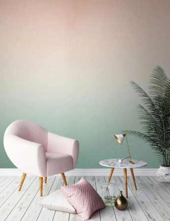
颜色,是室内设计的其中一环。对于颜色的选择,小编认为也有性别的迹象可循。下面带你去看许多可参考的颜色,让你为你居家的角落,动动巧思 ? 粉红色过渡到浅绿色,让人感觉有棉花糖的梦幻错觉~搭配上纤细的家具,让人感觉格外妩媚。
 军绿色的瓷砖,设计屋6角形,有种外太空的特别视觉效果。这样的特别瓷砖,不但适用于浴室,也适合各个休闲的角落。
 军绿色如果不用瓷砖来带出,也可参考选择以上的设计。只要把其中一个角落,改造成这样的色调,一定会让人感觉更有动力做事,无论是在这里化妆也好、办公也罢。
 有调查显示,女生如果拥有一个白色的客厅或套房,会更倾向于爱干净。这是因为整个空间的颜色氛围,影响着人的大脑神经。因此,如果你想要有纯白色的空间,可以建议你适当地选择黑色的装饰配搭,会让空间更舒服。
 浅蓝色调,也是女生们的菜。在主要墙面油上这个颜色,再将其他大型摆设选择纯白色,必定会让整个空间有宁静感。
 如果你喜欢复古风,你一定会喜欢上诉的设计。在厨柜的选择上是原木色的设计,而在墙架上则选择复古风十足的旅行箱设计。
 女生们对于室内设计的需求,大都是喜欢文艺风格。这是因为女生们对于功能性没有太大的需求,反之,男生们则是追求智能生活化等。
 黑白灰的室内设计,可以适当地搭配上深褐色、原木元素,这样可以让你的冷冷空间中不失温暖的气息,让人感觉更有烟火味。

 粉色调,一个女生们都无法抗拒的颜色。如果你害怕过于 girlish ,可以在这样的空间中混搭一些金色或是浅灰色等的色调中和,让空间的呈现更为温柔。
文章由 J 编辑
延喜攻略的室内设计
Choice Cabinetry: 6 Kitchen Cabinet Design Ideas That Totally Transform Your Cookspaces
Friday, November 20, 2020
As we pointed out previously in our guide on colours for the kitchen, it doesn't always have to be in white - although it usually is. This time around we take a look at a range of approaches to cabinets that will not only provide your kitchen with a different shade - but an altogether unique appearance as well.
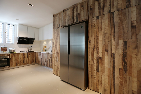
1. Wood Wood is coming back to our homes, thanks in part to the shifting mood regarding global climate change, we have been seeing a return of both laminates and hardwood in cabinetry bearing shades of reclaimed or varnished wood to complement rustic and modern kitchens alike. The homage to this natural material does not necessarily need to be overt - even when constructed from completely synthetic materials, cabinets can be decorated with cuts or classically-inspired detailing to imply that some carpentry was involved.
 Designer: Nu Infinity
2. Concrete Grey Exposed concrete is another material spotted making a resurgence, helping to create a masculine ambiance when paired with minimalist furnishings in post-industrial properties. While the use of actual concrete on cabinet doors would be impractical, the characteristic tone and blemishes of cement can be reproduced with a few coats of thinned grey paint on unvarnished wood to complement an industrial decor.
 Designer: X-Two Concept
3. Glossy / Reflective Glossy cabinetry is not a new component of 21st century kitchens, having been in heavy use since the processes behind laminates have expanded to produce a wide range of finishes. Give that sheen a purpose by selecting a material with an ultra-glossy or reflective finish for your cabinets, to visually enlarge the space and bestow your kitchen with a palatable elegance.
 Designer: Zanotta Studio Design and Renovation
4. Transparent Adaptable to a wide range of styles and colours, using completely transparent or frosted glass doors on your cabinets immediately turns your storage into display cases that can be completed with luxurious facility when fitted with internal lighting.
 Designer: Space Living
5. Metallic We've mentioned before that serious chefs seem to gravitate towards stainless steel countertops, and we are just as certain about their receptiveness to steel cabinetry. The clean and durable look and feel of steel lends itself well to post-industrial interiors, providing a greater measure of modern elegance than cement in the seamless welded joints and folded laps of steel sheeting.
 Designer: Archicentre
6. Underfoot Lighting We have all probably seen the use of LED strips embedded beneath upper cabinets to illuminate countertops, but you probably have not seen that same form of fixture being used beneath lower cabinets to light the floor. More mood lighting than task lighting, these LED strips introduce a dose of glam into what would be otherwise bland spaces.
 Designer: Jashen Interior Design
Click here to see more kitchens!

延禧攻略 | GIORGIO MORANDI 彩色盘搭配室内设计
Friday, November 20, 2020
@CreativeHomeMalaysia 将室内设计融入生活,以最流行的宫廷剧——《延喜攻略》特有的色调,再在室内设计的世界中搭配出来,让你可以将你的想象、喜欢的情节化为最真实的生活面貌。
2018年7月19 正式上映的《延喜攻略》中,深受海内外华人的喜爱,在短短数日间,点击率突破也让观众研究起故事中的一言一行,今天我们谈《延喜攻略》中的色调。 莫兰迪色系, 取名自于一位意大利人——乔治·莫兰迪(Giorgio Morandi)。他一生不曾结婚,没有任何有关他的爱情记录。基于种种他淡薄物外的生活做风,人们叫他僧侣画家。莫兰迪最显著的风格,就是他的创作题材仅仅局限在几只瓶子和波隆那郊外的风景。
 延喜攻略中的“莫兰迪”色系,是一种更有质感的灰色调。它的整体视觉效果不鲜亮,仿佛蒙上一层灰色调,不但不张扬整体的画面感,反而是体现出一种相互制约、相互抵制且独有的视觉平衡。这样的色调呈现出和平自持、舒缓雅致的特例风格。

肉粉系:像婴儿的皮肤色。代表比较活泼,天真无邪的少女色。
这样的颜色非常的温柔含蓄,是个适合家中各个角落的颜色。在这样冷暖适中的色调中,可以起到舒缓身心的作用。
紫兰调:一个灰蓝适中的过度色,让人感觉倍感沉稳
偏灰的紫、褐以及蓝,让整个用餐空间适合不同的光线。在自然光洒入之时,也可以完美融合暖黄灯光,让人安心。
靛蓝:这色很贵,早期由青金石里提取,后期找到植物里的替代品,才变得便宜,布料染色也得染N多遍,有钱有权的代表色。
大面积的靛蓝色,非但没有让空间看起来有压迫感,反倒和浅米色形成鲜明的对比,让空间冷暖适中。
蟹青:活蟹背部偏青的颜色(看新不新鲜),表现沉稳、静默的,属于比较高雅的色系。
该色调的空间,不知不觉会让人感觉慵懒 cozy, 想在这赖着的真实感受。这样的颜色可以塑造出布料所提供的舒适感,但是是反映在视觉层面的。
粉蓝系:粉蓝系让人感觉就像温暖的白云唔上灰灰的色泽,让人感觉有些哀伤。但,却也不失可以营造出独有的个人特色。
粉蓝色的沙发,在自然阳光的照耀下成了该空间的主角,沉稳而且不失大气,非常融合。
石黄:色彩来源于雄黄,视觉上和金色接近,只有皇权才能使用,越纯权利越大
这样的色系,是否让你感觉过于传统?经过设计师的巧手,这样的色系反倒让人感觉更贴近自然,而且不失皇者风范。


